
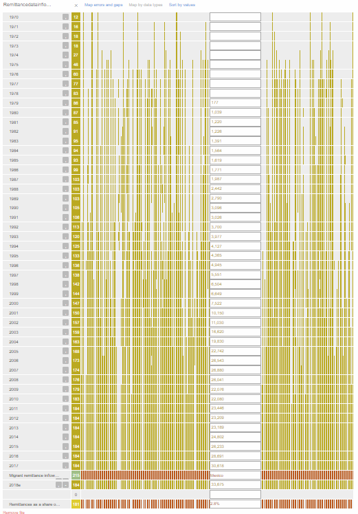
This week focused on visualization tools with an emphasis on relationships or networks within data. I decided to pursue my more law-focused passions and see what such tools could show about the current state of immigration within the United States. After some quick searching I came across the United States government’s Department of Homeland Security datasheets about immigration, particularly about remittance inflow and outflows. Remittance is the sending of money either from someone working in the United States to family in one’s country of birth or vice versa, receiving money from one’s country of birth while in the United States. I downloaded the spreadsheet tracking remittance inflows (which I believe means the amounts going from folks in United States to other countries) since 1970 to 2018. The results were interesting to look at for each country as some increased rapidly and others decreased. I was most interested in looking at Latin American countries like Mexico. What this shows is a staggering amount of folks from Mexico working in the United States are in fact here to support family. The Breve chart (screenshot below) captures this steady increase in remittance inflow, currently at an all-time high in 2018 of 33,675 million and representing 2.8% as a share of the GDP in 2018.
On the World Bank site where I found more information I came across this brilliant TedTalk that uncovers the broken system of remittances and just how much of the humanitarian relief weight immigrants are bearing. In fact, annual remittances account for $413 billion sent to developing countries which is over three times the annual amount spent in humanitarian relief aid ($135 billion). Millions of immigrants are NOT sneaking into the country to try to make it rich or coast off US government programs but are in fact a massive driving force in sustaining their own countries, no thanks to the shady colonial, exploits of the United States in developing countries.
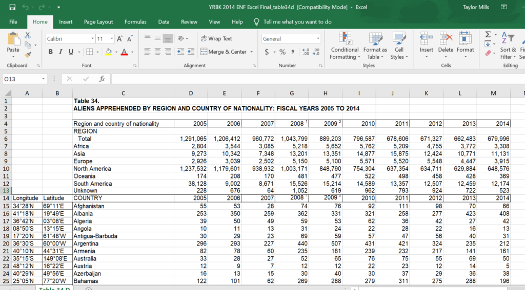
As for other tools, Palladio is brilliant when it cooperates. I’ve used it before and when it works, it’s a remarkable streamlined tool. I have the most difficult time getting the mapping part to work. Even after painstakingly entering in Longitude and Latitude for every country listed on the United States Department of Homeland Security data on how many people from countries all over the world were “apprehended” between 2005-2014. The exact language is “Aliens Apprehended by Region and Country of Nationality” which is all kinds of offensive. Here is an image of the spreadsheet with the input coordinates columns I added. Click the photo to access the full spreadsheet.
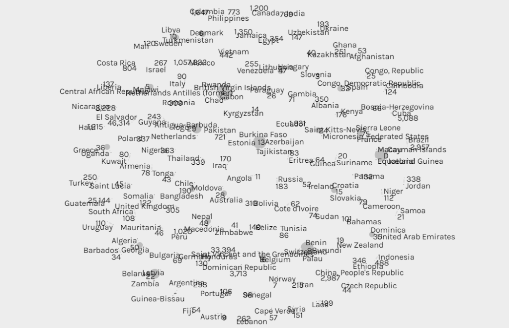
I was hoping Palladio would show sized nodes on a map with layers to show changes over time, but even after copy-pasting coordinates from this chart I still had no luck, so below is a Palladio graph that looks like a sunflower showing sized nodes indicating how many people were “apprehended” corresponding to different countries.
Not exactly helpful. But the map would be, and again, when Palladio works, it’s great. Here is a link to a tutorial I made for Palladio during my post-baccalaureate position for the Mellon Scholars Program. For general reflection, visualization and network programs are incredibly powerful tools that enhance arguments and clearly communicate relationships. In some ways I think these tools can be the most difficult to conceive of for a research project but can be the most rewarding when applicable and effectively utilized.